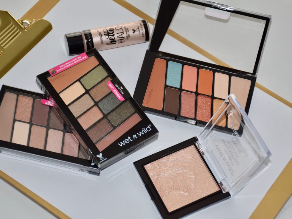
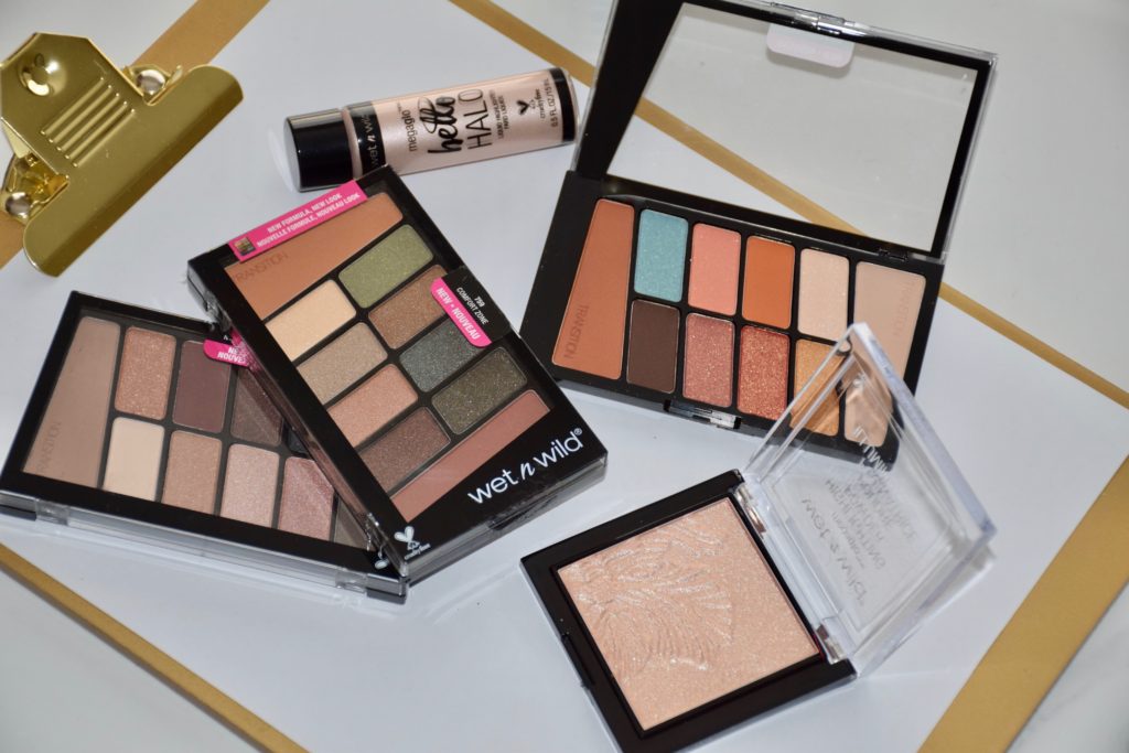
Wet’n Wild has always been one of my go-to brands for eye shadow! Not only are their eye shadows ridiculously affordable but some of them have actually rivalled high end counterparts in swatch and formula comparisons. The brand recently re-formulated their shadows, which made me incredibly anxious at first but after playing around with them, I can breath a sigh of relief. Anytime a brand changes an already good thing, us beauty junkies are prone to worry. I mean, Wet ‘n Wild palettes were already really well formulated so why change them? In addition to updating the formula, the brand also launched 4 new palettes (a few that may sound familiar to you) with 2 matte transitional shades that make them even better! I have 3 of the 4 Color Icon 10-pan Eye Shadow palettes to share with you today. Unfortunately, the one palette that I was most excited to try – Rosé in the Air – I wasn’t sent for review and haven’t been able to find in stores. Since that palette is being compared to the ABH Modern Renaissance palette, the hunt shall continue! In the meantime, I’ve been enjoying “Not a Basic Peach”, “Nude Awakening” and the newly updated “Comfort Zone” palette.
![]()
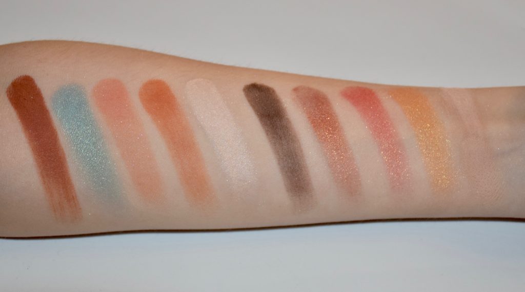
Wet’n Wild Color Icon “Not a Basic Peach”
Not a Basic Peach is a beautifully pigmented palette of warm peachy tones with a rustic vibe and a pop of colour. The matte and shimmer shadows are all buttery-soft and easy to blend. As expected with W’nW, the pigmentation of these shadows is great and the shades coordinate really well together. I love the pop of blue and burnt orange in this palette and think that both shades give it some serious personality! See below for swatches.
![]()
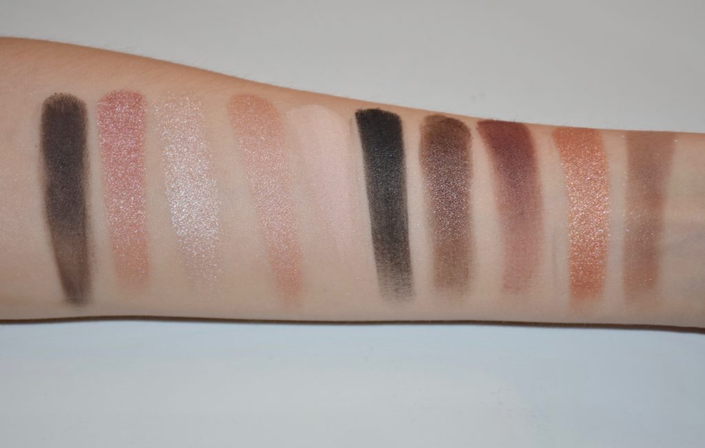
Wet’n Wild Color Icon “Nude Awakening”
Nude Awakening is a great economy palette for all you neutral lovers out there. The shades are perfect for everyday wear and for guys and gals that prefer more natural eye looks. Some of the shadows in this palette did apply a bit muddy and there was also some fallout with this one but overall it’s a great palette for the price.
![]()
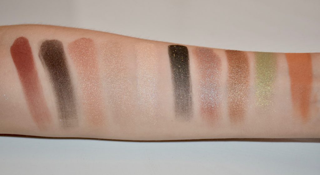
Wet’n Wild Color Icon “Comfort Zone” (new)
The original Comfort Zone palette is one of the brand’s most iconic palettes. It has been in their permanent line for years and includes gorgeous shades of brown and duo chrome greens. The updated palette is pretty comparable but includes 2 warm transition shades and a revamped layout. I have both palettes so you’ll be able to see the difference below. The new palette has slightly improved pigmentation otherwise the formula is the same, so if you liked the original, you’ll love the update!
![]()
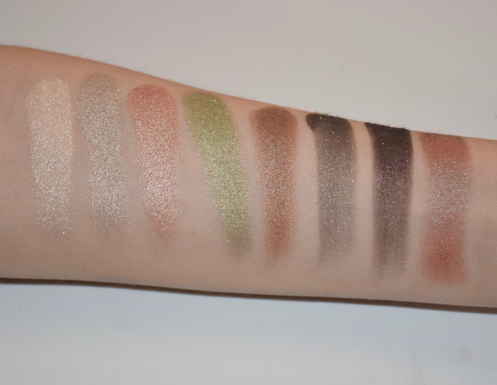
Wet’n Wild Color Icon “Comfort Zone” (comparison)
The original Comfort Zone palette is shown below on the left and the new palette is on the right. For reference and comparision purposes, the swatches below are of the old palette. 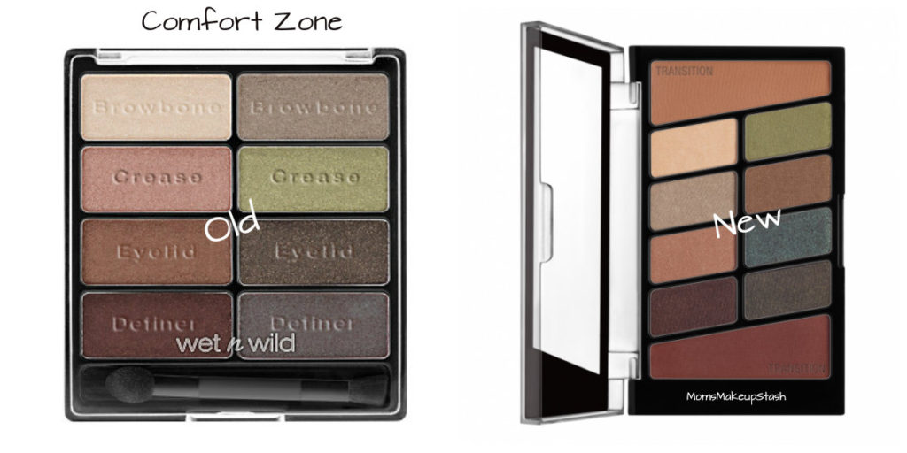
Wet’n Wild Color Icon “Rosé in the Air”
As mentioned above, Rosé in the Air is being compared to the Anastasia of Beverly Hills Modern Renaissance palette which retails for 7x the price! The new Wet’n Wild palette is a beautiful mix of warm-toned neutrals with a pop of mauve and berry. I can’t comment on performance as I do not yet own the palette but I did include a side by side visual comparison of Rosé in the Air and Modern Renaissance. Dead ringer right?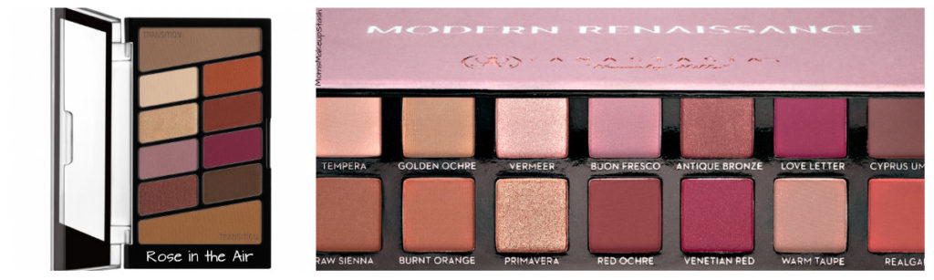
Overall, the Wet’n Wild 10-pan palettes are absolutely fantastic! You get excellent quality at an affordable drugstore price ($4.99 USD/$6.99 CAD). Wet’n wild took an already great thing and managed to make it even better by improving its formula and adding the much needed transitional shades. Color “icon” me impressed!


Stay Connected!